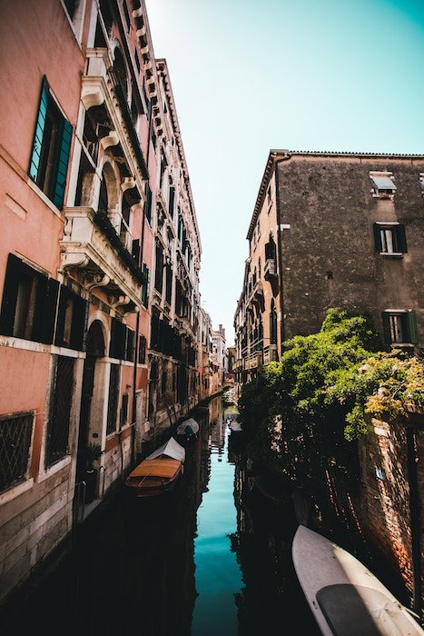
Teal and orange color grading has become popular due to Instagram. Instead of splashing out for expensive presets, you can replicate this look in Adobe Lightroom.
Read on for tips on how to create this trendy and stunning look.
Teal and Orange Color Grading: What You Need to Know
Color grading is the process of altering or enhancing the color in photographs or motion work.
One of the most crucial ways of developing a style in your photography is color grading. Color also influences the feel and mood of an image.
Teal and orange make an attractive combination. They are complementary colors on the color wheel. One makes the other pop.
This look has become trendy in travel, lifestyle, and even portrait photos on Instagram. If you’re new to color grading in Lightroom, mimicking this editing style may seem intimidating. But it’s easy with a few powerful adjustments.
Let’s go over some important tools in Lightroom. These will help you achieve the teal and orange editing style.
The Camera Calibration Sliders
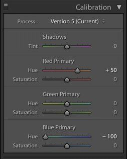
You can create the teal and orange look with the sliders in the HSL panel. It’s much quicker and easier to use the Camera Calibration sliders to shift the hues in your image. This will give you an excellent starting point to work from.
In the Lightroom Develop module, go to the Calibration Panel:
Moving the blue slider all the way down will give you a “teal” base. Choose a saturation level for each color that looks good to you.
This is a starting point meant to cut down time in the editing process. You’ll need to make other adjustments to the image.
Those adjustments will not be the same for every image. They depend on various factors like the exposure and your intention for the final photo.
The Basic Panel
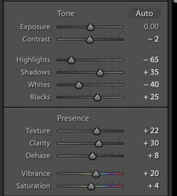
Once you have set a basic teal and orange color scheme, you’ll want to make some adjustment to the exposure, highlights and shadows, whites and black. You can do this in the Tone section, and add Vibrance and perhaps some Saturation in the Presence section.
Vibrance is a more crucial slider in Lightroom. It adjusts the saturation of the mid tones. The Saturation slider will add saturation to the whole image. More often than not, it has a heavy-handed effect.
You’ll need to make tweaks to all of these sliders once you’re done with the next step.
The tools in Lightroom are set up in a way that is meant create order in your workflow. But most photographers jump back in and out of panels. They make tweaks as needed until they have an edit they’re satisfied with.
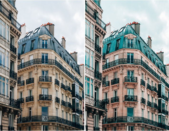
Here is the before and after of a shot I took of an apartment building in Paris. I made the adjustments in Lightroom.
The included example panels in Lightroom are for this image as well.
The Tone Curve
The next step is to work in the Tone Curve panel.
The Tone Curve is a representation of all the tones of your image plotted on a graph.
The bottom of the Tone Curve is the axis that represents the Shadows on the left and Highlights on the right. The “mid-tones” appear in the middle.
These are then further split into darker mid-tones, called Darks, and brighter mid-tones, called Lights.
The left axis represents the brightness or darkness of the specific tonal regions. The further up the left axis you go, the brighter the tones.
Within the Tone Curve, you can select all the colours—know as RGB. Or you can select the curve for each specific color individually. These are Red, Green, and Blue.
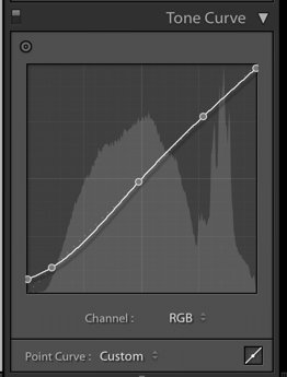
To adjust the Tone Curve, use the sliders in the Point Curve. Better yet, click the box in the lower right corner of the tone curve so that the sliders disappear.
Then create a Custom curve by directly dragging the line of the curve up or down to change the shape of it.
The image that you just adjusted with camera calibration looks much more vivid than those you are admiring on Instagram. Those images on Instagram have been given a more faded look.
You can get this look by flattening and lightening the shadows in the Tone Curve. You’ll preserve the mid tones.
To do this, lift up the bottom hand side of the curve up the axis to the point that you like. This is “crushing the blacks” and gives images a matte look.
Using Color Curves
Using Color Curves will allow you to work on colors individually to preserve their highlights.
Color Curves in Lightroom is used to fine-tune the color in specific regions of an image.
With Color Curves, you can adjust the color in a limited part of the tonal range versus the global adjustment (the whole image) you get with the temperature slider.
If your shadows are cyan you can reduce the cyan in the shadows through the Color Curve. This won’t impact the cyan in the whole image.
Same goes if your oranges are too vibrant in the mid tones.
To understand how Color Curves works, remember:
- Red is the opposite of cyan.
- Green is the opposite of magenta.
- Blue is the opposite of yellow.
When you decrease a color, you intensify its opposite.
Keep in mind that you don’t necessarily have to adjust every color in each image, every time.

Split Toning
This is a part of Lightroom that so many people skip over. It can be a very valuable tool. Split Toning is applied to different areas of an image based on its luminance values.
It allows you to add a specific color to the highlights and another to the shadows at different saturation levels.
Split Toning can be a great tool to use in your teal and orange photo edits. You can add coolness to the shadows (teal) and warmth to highlights (orange).
Lightroom offers you a balance slider helps you dial in the exact look you want. You can create more considered shadows or highlights by moving the slider.
You can add split toning to your images in two ways. You can either use the color picker or manually dial it in on the slider.
To use the color picker, click on the box nest to Highlights and Shadows. Use the eyedropper tool to pick the shade of orange or teal you want.
Lightroom will make the adjustment. Dial in the saturation that you want with the slider in the bottom of the color picker panel.
You can also just move the slider. Your image won’t be affected until you choose the saturation.
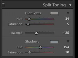
Choose the saturation first by moving it up to around +20. Hold the Option key down while you move the slider.
This will allow you to see the exact color applied to the image. Make your adjustment to the saturation once you have chosen your shade.
This is the method I recommend for a more precise application of color if you don’t know the exact value you’re going for.
For teal, you’ll be in the range of 150-180 or so.
For orange, the range will be around 15-40.
Note that split toning doesn’t affect any parts of the image that are pure black or pure white.
Split toning is a trick landscape photographers often rely on. You can use split toning in any genre of photography, provided you do so with a subtle hand.
It’s meant to help you add a bit of style to your photos. It’s perfect for those teal and orange images!

Tips for Further Tweaks
Here are some tips to help you further refine your image. You’ll create stunning teal and orange images.
- Add some clarity to your image.
- Play with the temperature/white balance to warm up or cool down your images.
- Try adding a lot of warmth to portraits by increasing the white balance to 7000+
- Decrease contrast to avoid a muddy look in some images.
- Add contrast if the image looks too flat.
- Taking yellow down (because it’s so close to orange) will make skin tones pop.
- Use the Luminance sliders in HSL to brighten colors for a vibrant look.
- Layer carefully considered Camera Calibration, Split Toning, and HSL edits for results with more depth.
In particular, watch the detail in your highlights and shadows during your editing process. Check the whites in your RGB panel. You may need to flatten them (drag the curve down).
Save Your Work as Presets
Editing can be a lot of work. If you’ve worked hard to find a color treatment that works well, Lightroom gives you the fantastic option to save it as a preset.
This will give you a recipe that you can rely on the next time you edit teal and orange images.
You can also save color curves that you have made for Red, Green and Blue. You can then apply them to other images.
To create a preset, click on the “+” button at the top of your Presets Panel on the left side of Lightroom. When the preset box pops up, check off the parameter that you’d like to save.
For example, “Tone Curve” so that when you use the preset on other images, your preset adjusts only the Tone Curve in that image.
If you’d like to save all of the edits you have made, click on “Check All” in the bottom left-hand corner.
Note that you may find that your preset might look great on all your travel photos. But it might look terrible on your people shots, giving them skin tones that are too orange.
You might want to create separate presets/edits for different genres of photography with the required tweaks.
Conclusion
Trends come and go. Who is to say what will become a classic look in photography? Teal and orange may be a flash-in-the-pan or it might linger around for a long time. Who is to say?
If you admire this look, go for it. You might come up with a style of editing that is distinctive to you and enjoy the process along the way.
