Color in photography combines art, science, and culture with your own personal style. Color can make or break the mood of a scene. And it can tell stories and create atmospheres.
Color is key to creating exciting and captivating images in film or digital photography. But it’s not just about filling your images with bright colors. There’s more to it than that. That’s why our article will tell you all you need to know about using color in photography.
9 Tips for Using Color in Photography
Here are nine valuable tips to master the art of using color in your photography. They will help enhance the visual impact and narrative depth of your images.
1. Learn the Basics of Using the Color Wheel
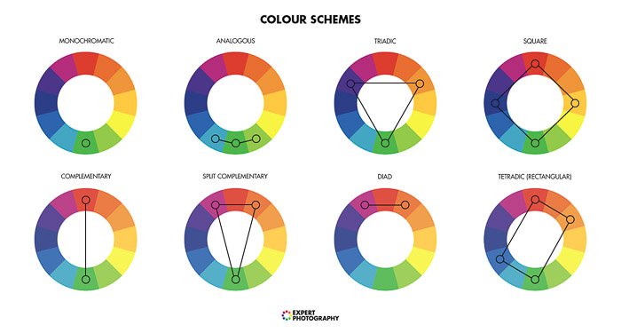
When it comes to color theory, the color wheel is the natural starting point. Studying the color wheel will help you understand different color schemes and color composition.
It will allow you to make conscious decisions in your color photography. You can create images with harmonious and balanced colors. Or you can break the rules to create discord and imbalance.
I don’t always adhere to the color wheel with complete devotion. But my favorite color photos tend to follow the rules. Color organization systems have been around for hundreds of years. But Newton’s and Goethe’s color wheels are two of the most well-known.
The basis of the color wheel is the primary colors—red, yellow, and blue. Each color combines with its neighbor to create the secondary colors—green, purple, and orange. There’s a whole science behind color theory.
Complementary Colors in Photography
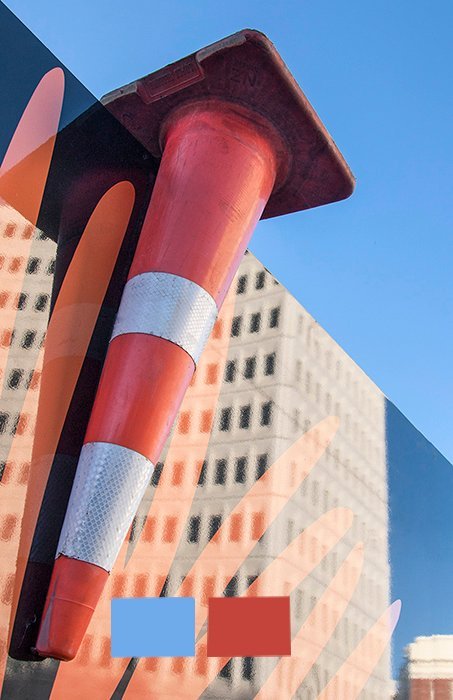
The color wheel makes finding complementary colors easy. Select a color anywhere on the wheel. Then, to find the color that complements it, look for the color that sits directly opposite.
A complementary color scheme has a bold impact. As both colors complement each other, the images feel vibrant and harmonious. The photos are visually appealing.
For example, the color that complements red is green. Yellow complements purple. And blue compliments orange. So, we can see that primary colors complement secondary colors.
I look for complementary color schemes in my urban and street photography. It makes my photos look fun and energetic, which is how I feel when shooting in a vibrant city.
Analogous Color in Photography
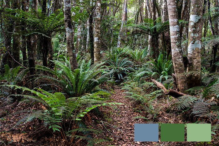
An analogous color scheme displays three colors that are side by side on the color wheel. This is an ideal arrangement in landscape and nature photography to reveal subtle differences in tones and hue.
Without the strong contrast of the complementary scheme, analogous colors are often calming to look at. Analogous colors feel like they belong together. They blend and create a sense of natural harmony.
Triadic Color in Photography
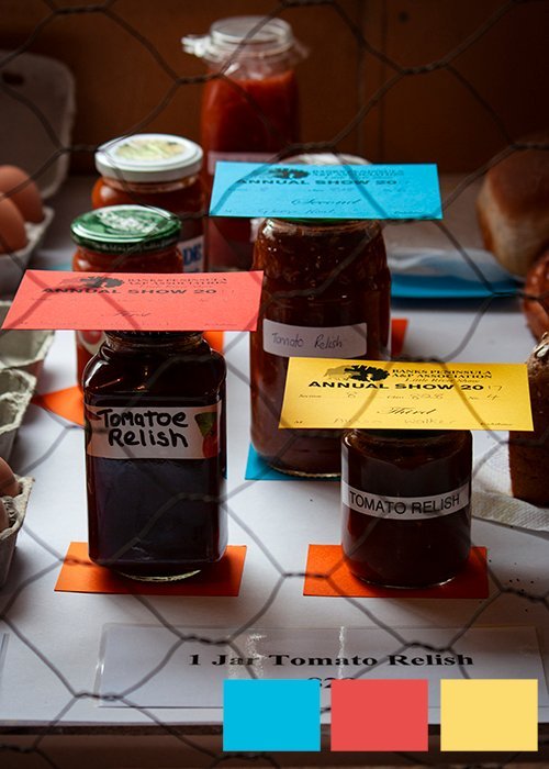
Triadic color schemes use three colors evenly spaced around the color wheel. A triadic color scheme creates vivid images because it uses three contrasting colors. Each color is clearly defined from the other, creating different points of interest.
These three color schemes are the best places to start with color in photography. Look for these schemes next time you’re out with your camera. You’ll start to see improvements once you consider color in photography.
2. Explore Cool and Warm Colors
Another aspect of understanding color in photography is the theory of cool and warm colors. There is a bit of debate about where cool colors end and warm colors begin. But generally, we say green, blue, and magenta are cool colors, while yellow, orange, and red are warm colors.
The difference between warmer and cooler colors is clearer if the two colors are far apart on the color wheel. It means warm and cool colors often complement each other. The warmer tone is more difficult to identify if they’re close together.
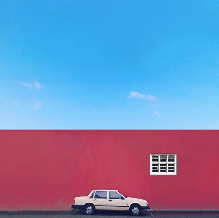
3. Evoke Emotion by Using Color
Color can have a big effect on our mood. Using color to affect mood can add power and meaning to your photography.
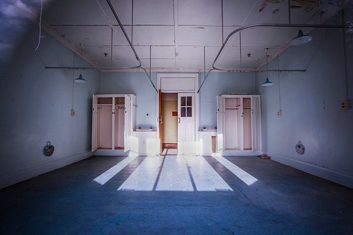
A scary, abandoned hospital will appear less haunted if bathed in warm, yellow sunlight in golden hour. The cold tones of the blues and whites in the photo below help to create a feeling of tension and unease.
Below are seven colors with some of their associated meanings and emotions. These associations help us use color in photography for visual storytelling.
- Red: Energy, excitement, passion, anger
- Orange: Warmth, happiness, enthusiasm
- Yellow: Cheerfulness, friendliness, creativity
- Green: calm, natural, balance, growth
- Blue: Serenity, cold, sadness, trust
- Purple: Spirituality, mystery, luxury
- Magenta: Innovation, transformation, non-conformity
4. Make It All About the Color
Color theory is all well and good. But the best way to learn about color in photography is to put it into practice.
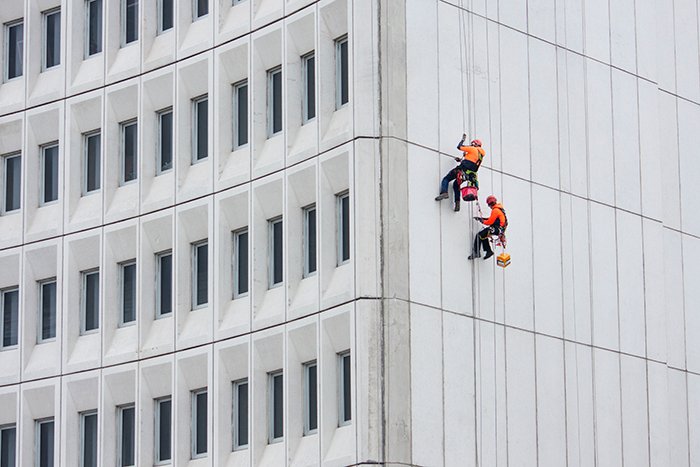
Look for your favorite color the next time you’re out with your camera. Methodically create your photos around it. In the past few years, orange has regularly appeared in my photos.
I attribute this to the “construction” orange around me as my city rebuilds post-earthquake. Although it’s not my favorite color, rich oranges have become a staple in my photography.
Try these five techniques to see what works best when using color in photography. Use your digital camera to create compositions full of color.
- Fill the frame with two or three hues in an abstract composition. Use a macro or zoom lens to get close and ensure the light is consistent across the surface.
- Photograph the color in an unexpected location for visual interest. A vivid floral green shirt in a sea of black suits makes a statement.
- Photograph the same color in different settings, like in nature, urban settings, or at home.
- Create a focal point by capturing your favorite color surrounded by a neutral shade.
- Venture into the night to see how color photos turn out when artificially lit.
5. Harness Time and Weather
At certain times and in certain conditions, you can shoot in black and white or color. But sometimes, color photography is needed to capture the splendor of a particular scene.
One of those times is golden hour. It’s that magical time when the sun is rising or setting. As the sun sinks low in the sky, the world is lit with rich, golden light. Color tones are deeper and less harsh than in the middle of the day.
High cloud cover can act as a softbox, giving you soft and even light. This gives you a lot of freedom to play with your camera settings. On a bright sunny day, colors are alive and vibrant. And you have a huge mass of blue sky to work with.
Get to know how weather affects the light at different times of the day. It can be beneficial when you’re working with color in photography.
6. Experiment with Tones and Shades
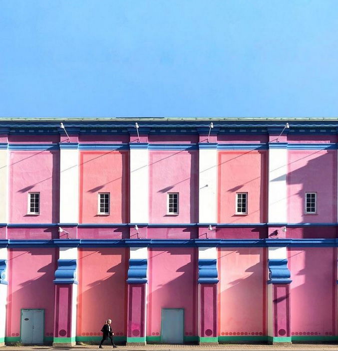
Color in photography isn’t only about bold colors or vibrant contrasts. You can also play with shapes and tones to make your photography interesting.
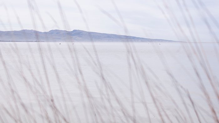
Consider using a monochromatic color scheme centered on different tones and shades of a single hue. You can play with natural tones of green and brown in woodland areas. Or an image of the ocean on a cloudy day will give you various pale blue tones.
Nature has very little pure white or black. Sometimes, an image might look black and white at first, but it’s actually an image with very muted color tones.
Many black-and-white photographers add color in post-production with the use of split toning. But this can be tricky. Make sure you don’t overdo it with the harshness of the colors.
7. Enhance Color Photography in Post-Production
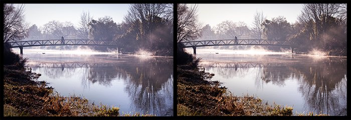
Loads of editing software bring out the best in your color photos. Test out the HSL sliders in Lightroom or Adobe Camera Raw. But keep the story of the photo at the front of your mind. Just because you can make sweeping color changes doesn’t mean you should.
If I want to add more punch to my color photos, I use the Dehaze and Clarity tools. Then, I adjust individual colors with the Saturation, Hue, and Luminescence sliders. This gives me complete control of each color.
If the light isn’t quite right or I want to create a different mood in the photo, I might adjust the Temperature and Vibrance sliders. And if I haven’t been paying attention to my settings, I might need to correct the white balance.
With big blue skies, I often reduce the luminescence to give the sky more depth of color. If green leaves and grass are too bright, I reduce the saturation of the yellow rather than the green.
8. Use the Right Photography Gear to Add Color
What if you have the perfect scene with beautiful color but don’t have your photography gear? Use your smartphone! This is an excellent way to practice using color in photography. The best camera is the one you have with you.
A polarizing filter is great for increasing vibrancy in color photos. It reduces glare and minimizes the need for editing. If you’re keen on landscape photography, this is a great filter to invest in.
When shooting with a digital camera, always shoot in RAW. It provides the most information for each photo, giving you greater color control in post-production.
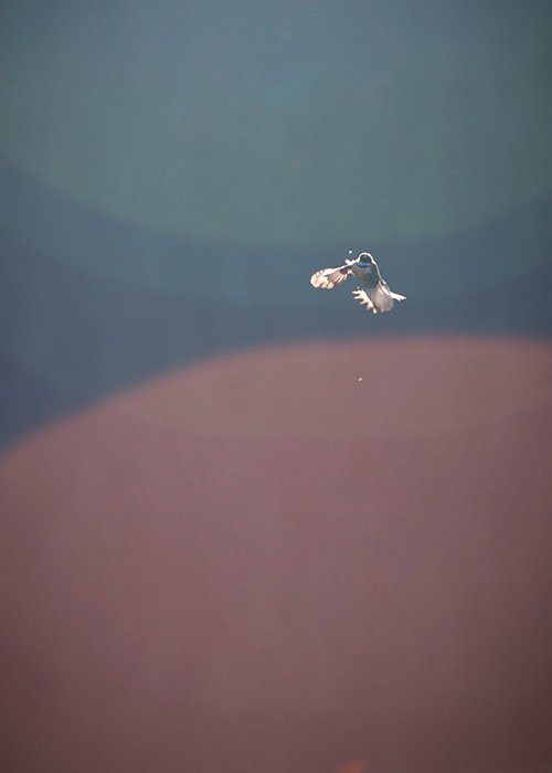
A lens hood blocks direct light that causes colored lens flares. But you can also use lens flare artistically, so don’t worry if you don’t have one.
And finally, take the time to properly calibrate your monitor. Ensuring your monitor displays an image accurately is essential. All the gear and techniques won’t be useful if you see incorrect colors and brightness.
9. Use Color for a Powerful Composition
Color in photography plays a huge part in photo composition. You can use composition to highlight color in photography. And you can draw the viewer’s eye to colors using leading lines, repeating patterns, and the rule of thirds.
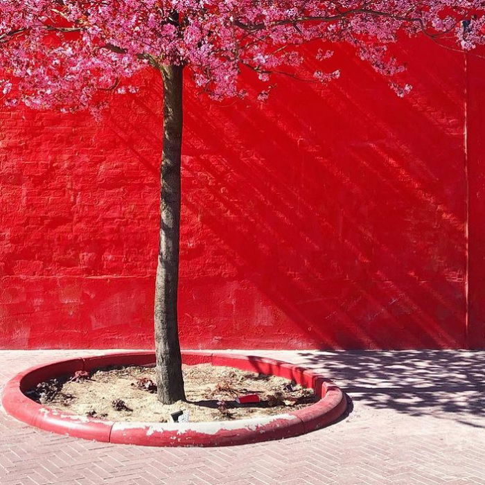
Or you can use color as a compositional tool. Use a composition with a lot of negative space to celebrate the color. Even though we use the term “negative space,” you can fill this area with the dominant color.
Color can dominate large areas of your photo. Or you can punctuate your shot with small patches of a primary color. You can have a strong contrast of colors and try color blocking. Or you can use similar colors to bring impact to your composition.
Conclusion: Using Color in Photography
Color in photography might seem a bit theoretical and scientific at first. But once you understand a few principles, understanding color in photography becomes natural.
Be deliberate when you include color in your photos. Put as much consideration into color as you would composition or framing. Experiment with different color schemes to create moods and explore tone and shade.
We hope this article has given you some inspiration so you can master color in photography. Take our Effortless Editing with Lightroom course to use post-processing to make your colors pop!

